1
2
As long-time wine makers and now proud grandparents, they wanted to incorporate some religious iconography into their label. Inspired by the wedding at Cana where Jesus performed his first miracle, turning water into wine, we were able to create a design that beautifully captures the essence of their love for wine and faith.
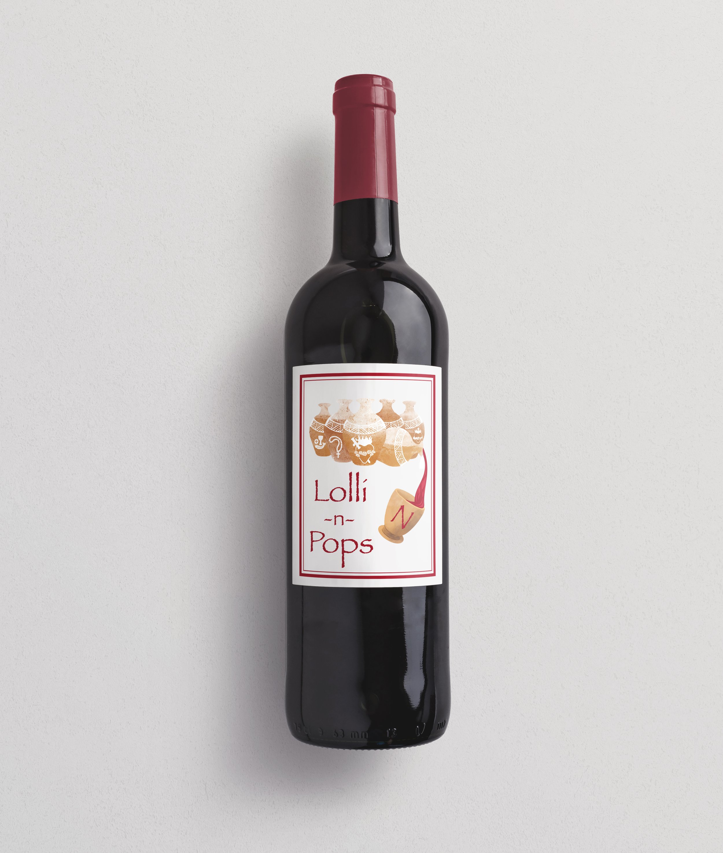
Wine Label Design
Lolli ’n Pops is a conceptual wine label design inspired by religious symbolism and the biblical story of Jesus turning water into wine. The client requested an illustrated label that referenced faith and ritual without feeling literal or overtly traditional.
The goal was to translate this inspiration into a visually rich, symbolic design that felt reverent, handcrafted, and timeless—while still appealing to a contemporary wine audience.
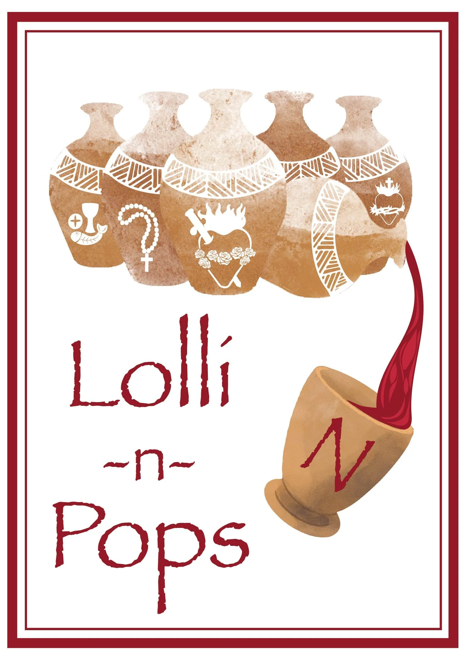
The primary inspiration came from the story of transformation—water becoming wine—often associated with celebration, abundance, and spiritual meaning. Rather than depicting the scene directly, the illustration relies on symbolism to convey the narrative.
Ceramic vessels reference:
Ancient wine storage and ritual use
Biblical-era craftsmanship
The act of holding and transforming something sacred
Religious symbols integrated into the vessels were carefully chosen to feel iconographic rather than illustrative, allowing viewers to discover meaning gradually rather than being confronted with overt imagery.
Illustration Style: Hand-painted, textured forms inspired by ancient pottery
Color Palette: Warm earth tones, muted reds, and parchment neutrals to evoke age and reverence
Composition: Vertical storytelling, guiding the eye from the vessels to the pouring wine
Tone: Sacred, historical, intimate
The spilling vessel reinforces the miracle itself—movement, abundance, and transformation—while keeping the imagery subtle and poetic.
Religious symbols were simplified and unified to maintain visual harmony
A restrained color palette ensures the symbolism feels timeless, not decorative
Hand-drawn typography complements the organic illustration style
The border frames the label like a manuscript or sacred text, reinforcing context
Every element was designed to support the narrative without overwhelming the label or alienating modern consumers.
The final label successfully balances religious symbolism with contemporary illustration, creating a piece that feels meaningful, respectful, and visually distinctive. The design demonstrates an ability to interpret sensitive subject matter through metaphor, texture, and composition rather than literal depiction.
This project highlights strengths in:
Conceptual thinking
Illustration-driven branding
Symbolic storytelling
Packaging design
Adobe Illustrator
Adobe Photoshop