

Lantern & Leaf
Branding + Event Marketing Concept
Project Type
Self-initiated branding and promotional design concept
Role
Brand Identity, Illustration, Marketing Design
Project Overview
Lantern & Leaf is a conceptual independent bookstore brand created to explore how illustration-driven branding can support community-focused marketing. The store emphasizes cozy spaces, literary events, and thoughtful programming centered around storytelling and local culture.
The goal of this project was to design a visual identity and promotional materials that feel warm, inviting, and timeless, while remaining flexible enough for recurring events and social media use.
Objectives
Create a distinctive bookstore identity rooted in warmth and storytelling
Balance illustration and simplicity for scalability across print and digital
Develop realistic promotional materials an independent bookstore would actually use
Showcase brand consistency across logo, merchandise, and event marketing
Brand Concept
The lantern symbolizes guidance, warmth, and shared stories, while the leaves represent growth, learning, and quiet reflection. Together, they evoke a place where stories are discovered and linger.
Brand Tone
Cozy
Thoughtful
Literary
Community-focused
Tagline:
Where stories stay lit
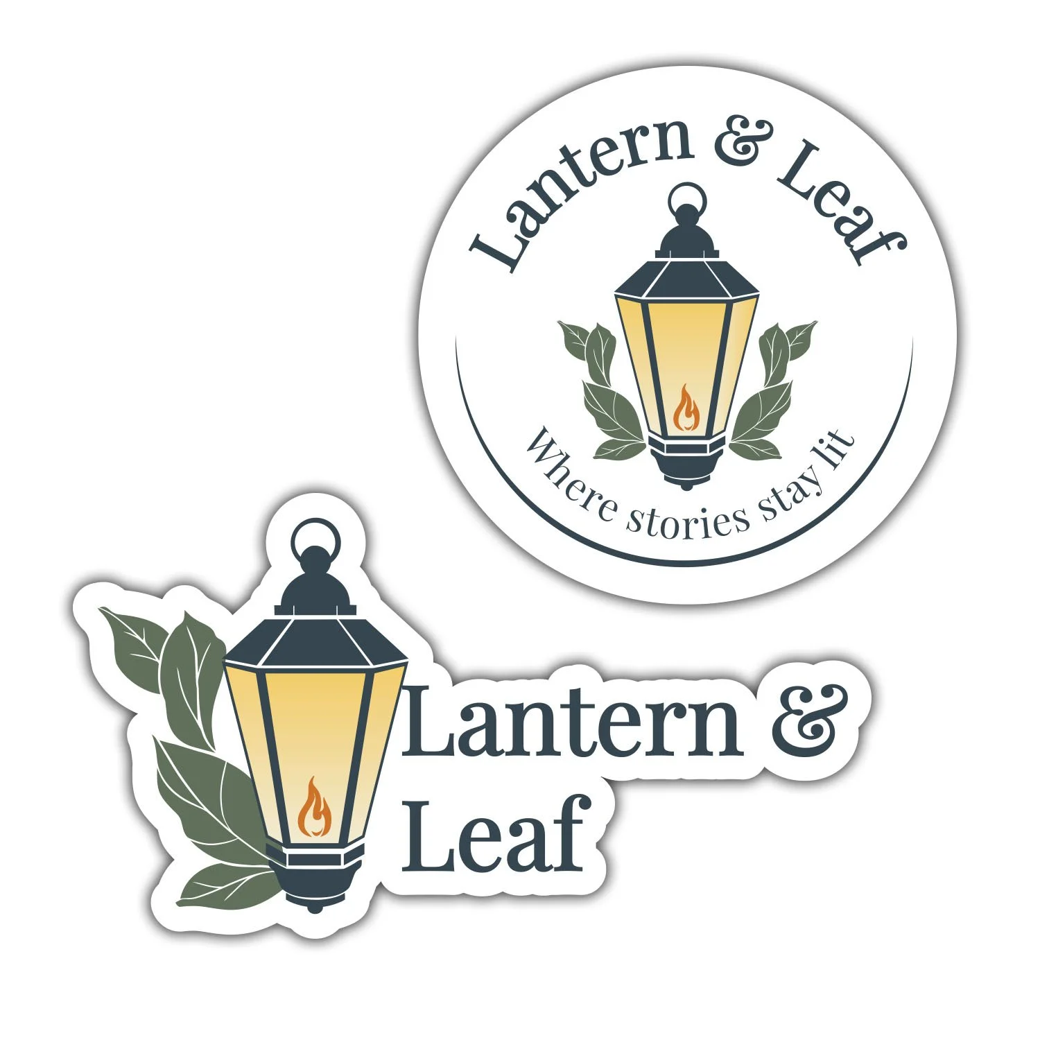
Logo Development
The logo was developed through multiple iterations, balancing illustrative detail with clarity and usability.
Final Logo Features
Illustrated lantern with a soft internal glow
Subtle leaf framing to reinforce the bookstore’s organic, welcoming feel
Limited, muted color palette for a timeless aesthetic
Designed to function in full color, simplified color, and monochrome applications
Special attention was given to ensuring the logo remained legible and recognizable at smaller sizes, such as stickers and social media icons.
Color Palette
The palette was intentionally restrained to avoid visual noise while supporting warmth:
Deep slate blue for structure and contrast
Muted green for organic accents
Soft cream and warm gold tones to suggest lantern light
A subtle gradient was introduced in the lantern glow to enhance warmth without overpowering the mark.
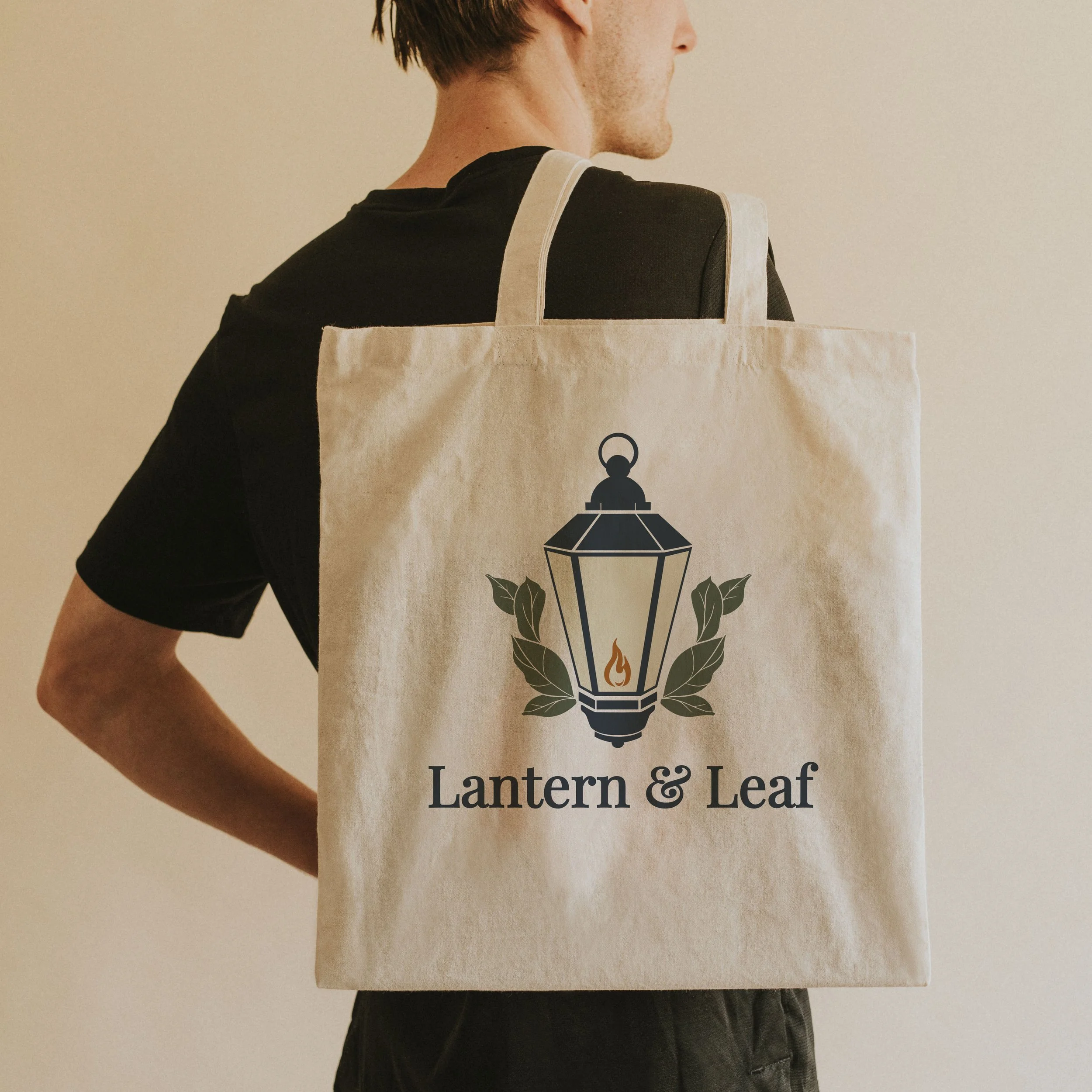
Promotional Applications
To demonstrate real-world usability, the logo was applied across several common bookstore touchpoints:
Merchandise
Die-cut logo stickers
Circular logo seal for packaging or book bags
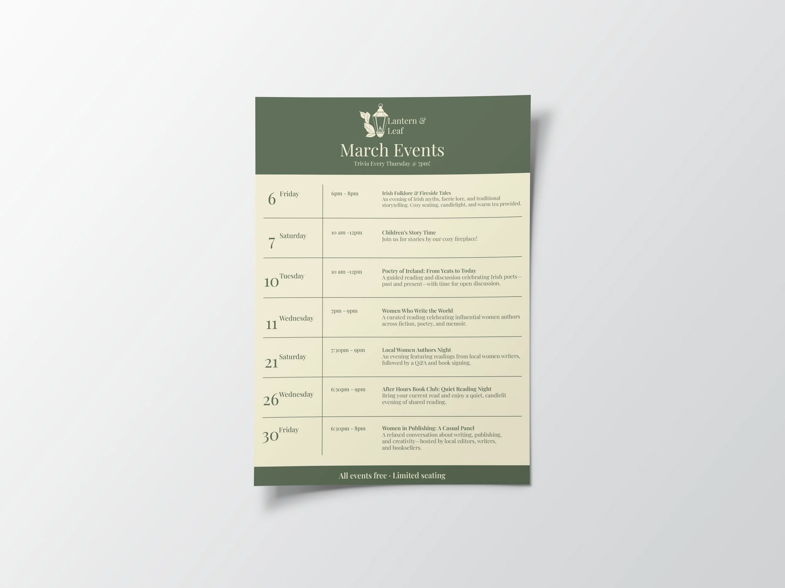
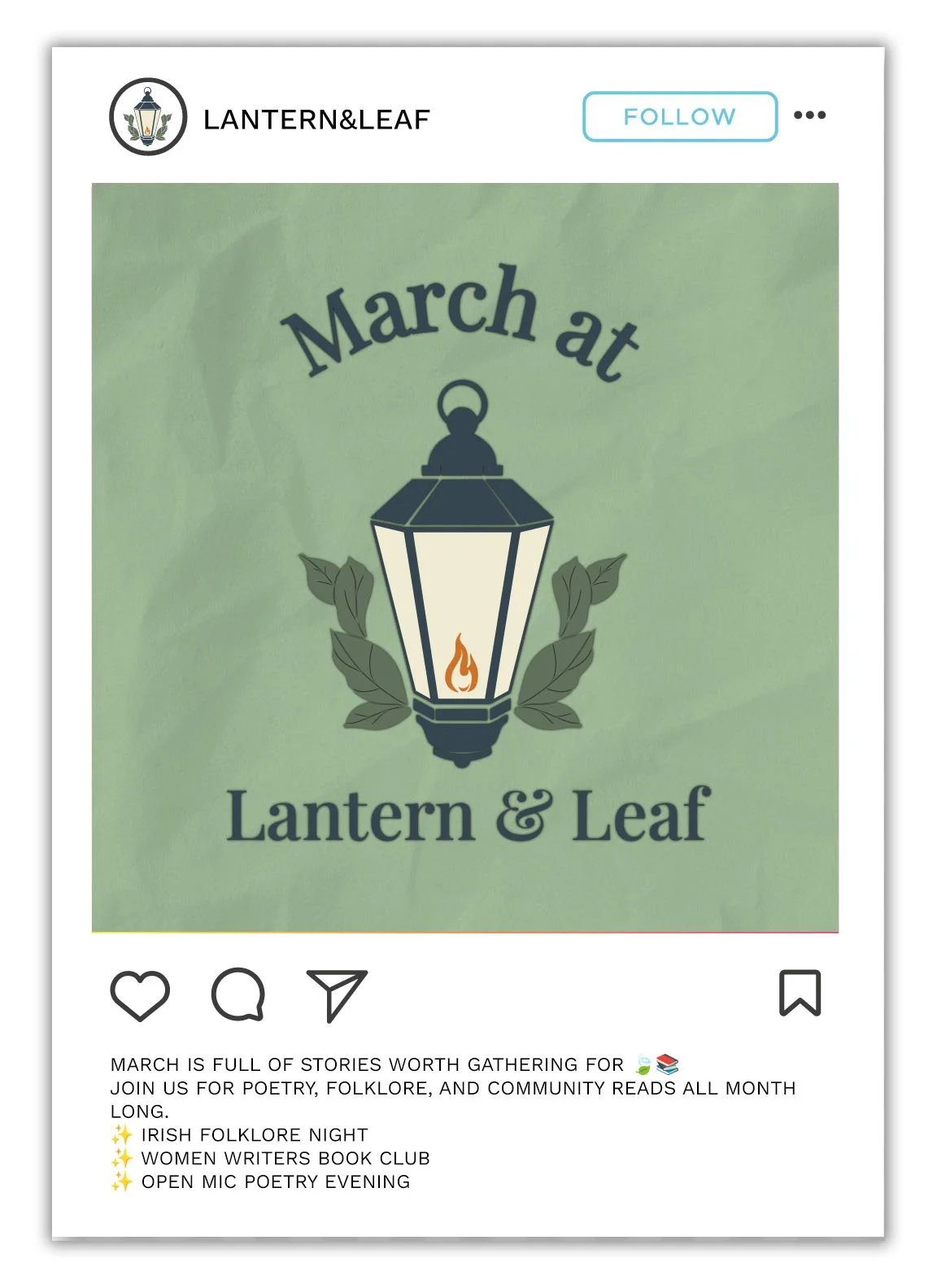
Event Marketing
Monthly event flyer (March)
Social-media-ready event concepts aligned with:
Irish Heritage Month
Women’s History Month
Example events included poetry readings, local author nights, folklore storytelling, and quiet reading evenings—events typical of a small, community-driven bookstore.
Design Decisions
Illustration was prioritized to give the brand personality while maintaining clean outlines for scalability
Typography was kept classic and readable to support long-term use
Layouts were designed to be easily updated month-to-month without reworking the brand system
This approach reflects how small businesses often need flexible, reusable marketing assets.
Outcome
This project demonstrates my ability to:
Build a cohesive brand system from concept to application
Integrate illustration into functional branding
Design promotional materials grounded in real business needs
Balance aesthetics with usability and clarity
Lantern & Leaf serves as a strong example of branding for a local, community-focused business, showcasing both creative storytelling and practical design thinking.